How to Optimize Emails for Mobile
If you are anything like me, you get a little nervous when you can’t find your smart phone.
You sweat, panic a little, and then breathe a huge sigh of relief when you find it. Phew! Back to instant access, text messages, apps, and email. The bad news is that we might have a little bit of an addiction, but the good news is that we aren’t alone.
Smart phone usage is on the rise. In fact, according to a study by the Pew Internet & American Life Project, as of February 2012 nearly half (46 percent) of American adults are smartphone owners. Another Pew Project study also noted that 87% of smartphone owners access the Internet or email on their handheld, including two-thirds (68 percent) who do so on a typical day.
With these numbers continuing to rise, it is essential that you develop a mobile marketing strategy for your emails to ensure that your recipents get the best user experience from your messages.
Here are some top tips for creating mobile-friendly emails.
1. Use MIME multipart format. Multipurpose Internet Mail Extensions (MIME) is an internet standard that allows your emails to be send in both text and HTML format so that they are visible on phones that may be set to text only viewing.
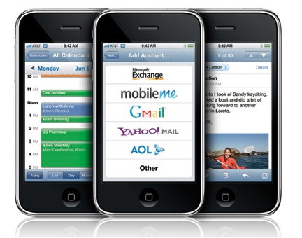
2. Take time to enjoy the view. Always check what your email looks like in multiple formats. Email service providers, like Fluttermail, allow you to view how your email will look in various email clients, including iPhone.
3. Keep subjects short and sweet. Most mobile devices cut off email subjects at 15 characters. Make your subject lines urgent and as concise as possible. Put the most important information at the beginning to ensure that your recipient sees enough to want to open it.
4. Make your text readable on both mobile and computers. Font sizes should be legible on desktops, laptops, tablets, and smart phones. Don’t use fonts any smaller than 13 pixels or medium. Anything smaller may be resized by some email systems like Android and iPhone.
5. Touch and go. Buttons and links should be easy-to-see and large enough for touch screens. Recommended size is 44 x 44 pixels rather than a see of smaller links.
6. Call them to action! What do you want your recipient to do? Tell them! Keep your call to action at the top of the email. Any lower than above the content will get lost.
7. Simple is better than pretty. Pretty may look nice in design, but it doesn’t always translate well on a mobile device. Stay away from emails that are one large image. Spam filters don’t like them and some phones don’t either. Keep your text to image ratio smaller to avoid any issues.
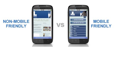
When designing mobile emails, the most important thing is that your website is mobile friendly too. There is nothing worse than sending a visitor to a site that isn’t optimized for mobile viewing. You got them to click on your email, you don’t want to lose them on your website because they can’t read it properly. Always keep the user experience in mind and track, track, track.
Have you started optimizing your emails for mobile devices? What suggestions do you have?
Tagged in: Apple, iPhone, Pew, Smartphone

