Should The Unsubscribe Link Be at the Top of Emails?
There has been a lot of discussion recently about unsubscribe links. Much of the discussion has revolved around the idea of placing the unsubscribe link at the top of your marketing emails instead of the traditional location at the bottom of the email.
Have you thought about moving your unsubscribe link?
Spam filters are getting more stringent on the emails they allow into inboxes. People are also becoming frustrated with the amount of email they want. Instead of looking for the unsubscribe link they are quick to hit the spam button.
The argument for locating your unsubscribe button centers on the idea that you want only the people on your list that truly are interested in your email content. If someone doesn’t want to subscribe you want to make it easy for them to leave without tarnishing your brand by hitting the spam button.
Let’s look at a few ways you can design your email unsubscribe links to ensure your list is optimized for only the best subscribers while allowing others to leave without fuss.
Unsubscribe Link Design Options
There are some really good arguments for adding the unsubscribe link to the top of marketing emails. A few recent articles covered this area in depth including some testing results:
- Gmail Pushes Unsubscribe Links To The Top Of More Newsletters
- Unsubscribe Link Placement: Up Top Or Down Low?
- Third Major Retailer adds Pre-header Unsubscribe Link
The basic thing you need to know about moving your unsubscribe link to the top of your emails is that your unsubscribe rate will likely increase while your conversion rate should also increase. It’s simple. You weed out the people that aren’t ideal subscribers and optimize your list so only the best subscribers are getting emails. It makes sense that your conversion rate would increase.
The top is an appealing location for the the unsubscribe link. Here are thoughts on designing the unsubscribe link at the top of your emails and other potential locations.
Top of the Email
Today it is difficult to find retailers and email newsletters that put the unsubscribe button at the top of the email. It is common, however, to see links that appear like this:
Mobile Version | Web Version
This is mentioned in the first post linked above. I like the idea of adding the unsubscribe link to this area at the top of the email and potential a preference link as well if you have a preference center.
The new link area would potential look like this:
Mobile Version | Web Version | Email Preferences | Unsubscribe
It’s important to remember that it is ok for the unsubscribe link to stand out. You want people to view is easily. If someone has made up their mind that they don’t want to receive your emails you do not want them to hit the spam button. Let them walk away cleanly with little frustration.
As for the design of the unsubscribe link you can use the simple link structure above or you can get a little creative. You can use icons or use a bulleted list format. Just remember that people are still used to clicking underlined blue text. They know what it is and they aren’t afraid to click it. Give them an easy option that is not confusing.
Bottom of the Email
It’s much easier to find examples of companies that include their unsubscribe links at the bottom of emails. This is the traditional location for the links and it’s actually the place where most people expect to find the unsubscribe link.
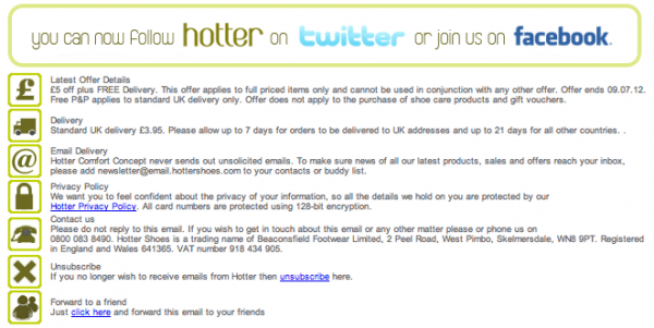
I like the way Hotter Shoes has designed their unsubscribe links at the bottom of their emails.
Friendly icons are used for each of the areas in the footer of the email. Hotter Shoes still uses the classic underlined text for the unsubscribe. That’s a good way to allow people to find the link if they prefer to unsubscribe.
You can get creative with the way you present the unsubscribe link. The most important thing to remember is that recent testing – as shown above in the links – shows that unsubscribing is ok. It’s better than being marked as spam. It also optimizes your list for only the best subscribers.
Sidebar Options
Another option for some email designs is to locate the unsubscribe link in a sidebar. Some emails, especially some email newsletters, will have left and right columns for their email design template. It’s an option to locate your unsubscribe link or button in this location as well. Remember that you want people to notice the link if they’re looking for it while not taking away from the main goal of the email, which is likely to get clickthroughs to your website.
Testing and Reporting Metrics
Like the companies in the links above it’s important to remember to test and analyze the results of your emails. If you’re considering moving your unsubscribe link you should have a goal in mind. That goal should be to improve the overall performance of your emails in terms of conversions and profit.
When it comes to unsubscribe links profit comes from having the right amount of subscribers to optimize the top line sales while keeping costs down. Having a domain that is blacklisted because of spam reports is costly. It’s difficult to undo this so allowing people to unsubscribe is a cost cutting goal.
Making your unsubscribe link more prominent may also make it more of a focus to create relevant email content. It’s obvious, but people want interesting items in their inboxes. Knowing that people can use one click to unsubscribe might make it more important to work on the emails you create even if you’re creating great emails already.
What are your thoughts on the unsubscribe link?
What’s the best location in your opinion?
Tagged in: spam, Unsubscribe
