How to Use Color in Email Marketing Design
Do you ever see emails that are simply boring?
What is it about some email marketing programs that makes them boring? I’ve been noticing a few emails that look the same each time I open them from my inbox. I look forward to the email, but sometimes I’ll go as far as opening the email and then hitting the trash link.
Getting attention and being interesting is first and foremost about the content in the email, but even if you have something interesting to say and share you risk losing the interest of your subscribers. Interest includes the design of your emails and if you’re not focusing on the design of your marketing emails you could be missing out on conversions.
The biggest aspect of design I have noticed lately that successful email marketers are utilizing is color.
There is no big secret to using color in your marketing emails, but there are a few simple concepts to follow.
Using Color to Attract Attention
The first obvious method for utilizing color in your marketing emails is to attract attention. Every day people receive tens and even hundreds of emails from various sources. Friends email. Business associates email. Marketers email. It’s difficult to stand out in the inbox with all that content flowing. Yours has to be interesting enough at first glance to gain the attention of people.
Color is a tool that most email marketers overlook. When trying to earn attention of people you want to use color in a way that is not loud, but simply appealing to the eye. Let’s look at a good example.
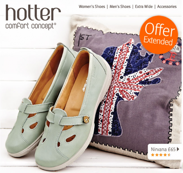
Hotter Shoes
I’m a big fan of the Hotter Shoes email campaigns. What Hotter Shoes does well is to use color to be appealing. The use subtle colors to jump off the page of what appears to be a simple white or off white background. You notice the colors, but they don’t scream at you with this creative. It’s a good example of how to be interesting with your email design without being loud. You attract attention and if you can do it with each email people will actually look forward to seeing your emails in the inbox.
Using Color to Convert
The goal os any email campaign is to convert. You want people to clickthrough to your website and take action. This could be with a sale or it could be to get them introduced to a new product or service you’re offering.
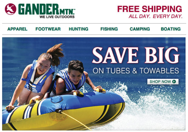
I like what Gander Mountain did with a recent campaign.
Gander Mountain
Gander Mountain has a simple email program. They do like to use color, however, to earn attention and call subscribers to action. The button for the “Shop Now” call to action is simple and it could stand out a little more, but it’s good. You always want your subscribers to know that you want them to do something. It’s not just about attracting their attention, but about getting them to take action. This email also does well to bring about the feeling of summer. Doesn’t it make you feel like a bright summer day? Buying is about emotion. It makes sense to use color to bring about emotion in your subscribers. It gets them to take action.
Using Color to Earn More Subscribers
C. Wonder is a company I actually learned about while watching The Pitch. It’s an interesting brand that appeals to a specific kind of person and more specifically to women. If you check out their website you’ll see how they use color as part of their brand. It makes sense that their email campaigns would use color in a great way.
Here is a recent example of their email program.
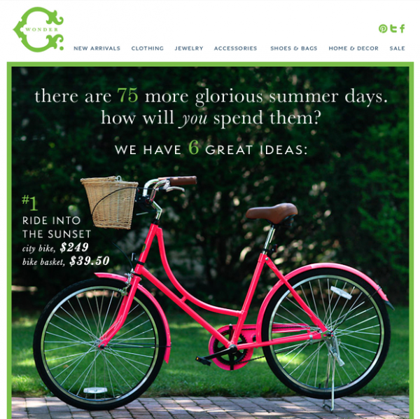
C. Wonder
First off you notice the pink bike as it jumps off the screen from the simple green background. C. Wonder uses this green throughout their branding and they do a really great job of finding colors that jump off that base color. The pink here is a great example.
This email campaign is a great list of suggestions for summer must-have items. Here you see the first item. Click on the image to see the other items that C. Wonder has suggested.
You can do emails like this. It’s great for building your subscriber base. People love getting suggestions like this and they’ll tell their friends when the emails are really interesting. I think the C. Wonder emails are interesting both for the content and the color that is used. The color is part of the brand. It doesn’t have to be the main focus of your brand, but you can use color to enhance your content.
If you have interesting emails people will share those emails and your subscriber list will grow. It’s better to focus on the utility of your emails instead of where the forward to a friend link is located.
Color can add a great deal to your email designs. Try using color in these three ways to improve your business and grow.
Tagged in: C. Wonder, Color, Gander Mountain, Hotter Shoes


