Five Tips For Designing A Foolproof Sign Up Form

When you operate a business, you need your email marketing campaigns to be successful. Email marketing has been one of the most rewarding marketing avenues and contributes more to online sales than most other digital channels, only SEO can compete with email marketing.
However, for your email marketing campaigns to be successful, you need to ensure that you’re constantly growing your list. There are numerous reasons for this including:
- Subscribers will occasionally disappear (i.e. unsubscribe or close their email account).
- The more emails you get, the more revenue you can generate.
- You can send different campaigns to various demographics depending on where they are in the sales process.
To increase the number of subscribers you have with your mailing list, you need a sign up form. There is an art in developing a sign up form. Here are several tips to help you get started.
1. Keep Your Form Simple
When it comes down to it, you want to ensure that your sign up form is simple. Audiences should be able to look at it and know exactly what they have to do, what they’ll get and it can’t be cluttered. Therefore, keep the amount of information needed to subscribe small. Perhaps only ask for an email address.
The longer the form, the lower the conversion rate will be for you as well. This can be an important point. Visitors are often lazy, so you have to make it as easy as you can for them. Keeping a form simple, also allows you to place the form in different parts of your website, like on a sidebar.
2. Put A Visual Reminder Of What They’ll Get On The Form
If you’re giving something away to website visitors, to get them to subscribe to your mailing list, then visualise the giveaway. This makes your offer more tangible to audiences and allows you to increase conversions.
Good examples of how you can visualise the offer include:
- An image of a book for downloadable ebooks.
- A big version of the discount offer.
- An image of the free prize.
3. Use Specific Words In The Copy
When writing copy, certain words will be improve your conversion. By using words like ‘my’ instead of ‘you’, you can increase the conversion rate by about 90%. At the same time, you need to add specific language into the form that makes the offer urgent. A good example of this is by saying an offer is only open for a set period, or there is limited stock.
Finally, you should add social pressure to copy by including statements like, ‘join thousands of your peers’ or ‘sign up like 10,000 other customers’. Adding social pressure inside your copy can ensure that audiences subscribe because they want to feel part of a community.
4. Don’t Use Typical Verb Words
One mistake that many businesses make is that they stick to the same, traditional words like ‘download’, ‘sign up’ and ‘buy’. These are often seen by audiences as tired and aren’t as convincing as they once were. Instead, you need to use more persuasive words like ‘get’ and ‘learn’.
These words have a less transactional feel to them to customers and because they aren’t overused by businesses, they are more persuasive.
5. Present An Unfavourable Option
Fear is a powerful emotion you can use. One way is to use social pressure and the chance of missing out on something (see above). The other is by providing an alternative that is less attractive to the audience. For instance, you could provide the options of ‘I would prefer to pay full price’ or ‘I don’t want more traffic to my site thanks’ and audiences will be more inclined to convert on your signup form.
Conclusion
Get more subscribers to your mailing list. Use the tips above to improve conversions and increase revenues by growing your mailing list.
Do you have any tips for improving your sign up forms? Have you used any of the above?
Let us know in the comments below.
Read post Post a Comment. Tagged in: CRO improvement, sign up forms, subscription management
If You Get This Right, You Can Grow Your List

How can colours helps you subscribe more people to your email list?
Growing your email marketing list is one of the most effective ways to grow your business. Not only does email marketing offer one of the best returns, but customers also trust email marketing more because they have opted-in to view this marketing content.
To ensure you have the best results from email marketing, you need to look to grow your email list daily. The larger your list, the more revenue you can generate from every mail you send. However, growing your list isn’t easy.
One of the greatest challenges you might find when dealing with a sign-up form is the colour of a call-to-action, page, or other item on a webpage.
Why Is Colour So Important?
Colour is a vital part of any landing page design. Research has shown that 90% of customers make a decision based on colour alone. Therefore, use the wrong colour, or combination of colours, and your brand could lose out on email details of potential customers.
Colours are also great emotional pulls. Certain colours will invoke feelings in website visitors, so for instance, you can make them jealous of what others have, or fearful of missing out on a good offer.
A mismatch of colours can also have a disastrous impact on marketing. It can put visitors off and lose you potential subscribers. But that doesn’t need to be the case. In fact, you can easily fine-tune your website’s colour scheme to get better results. Here are a few tips:
1. Analogous Colours Are Best
These are colours which are next to each other on the colour wheel. They can be different shades of the same colour or colours which are similar. These blend nicely into the design of the page and help brands to establish a single value.
This tactic is great for those brands who want to use primary colours in their branding. However, it can also be effective with non-primary colours.
2. Opposites Attract
Many say that opposites attract which is no less true for colours. By using colours on the opposite side of the colour wheel you can create stunning designs. Examples of this are blue and orange, red and green, or purple and yellow.
This scheme works best if you are using non-primary colours. Make sure you use the right shade of each of these colours as a slight tweak can look wrong.
3. Contrast
There are many ways you can use contrasting colours to highlight your signup form on any page. For instance, you can contrast the form itself against the rest of the page. This draws the attention away from other content to the sign-up form message and is highly useful if you have placed the form on the right-hand side of the screen where less attention is usually applied by readers.
Another tactic is to contrast the button to the rest of the sign-up form. This is to draw attention to where you want the audience to press. This is really good on a landing page with lots of text.
Your Brand Needs It Identity
One of the most important aspects of marketing is to ensure all the content published, whether it’s email or website design, social media or elsewhere, is aligned to the value and identity of your brand. Any mismatch, however good for increasing engagement, will not be good for your brand in the long-term.
So, look carefully at your brand, its core values and everything else, and determine what colours you can and should use. Then carefully consider what your audience wants to know about your brand and what emotions they want to feel when they buy from you.
This should help you decide what colours to use and how to use them throughout your marketing and especially with your sign-up form.
How do you attract people to use your sign-up form on your website? Have you attempted to change colours to get better results?
Let us know in the comments below.
Image from Pixabay
Read post Post a Comment. Tagged in: sign up forms, signup strategies, subscriptions
How To Optimize Your Subscription Forms
 Signing new people up to your mailing list is an important task of your email list maintenance routine. Offering something of value to potential email contacts and including a sign up form on landing pages, have both proven to be highly effective.
By optimising your subscription forms, you can improve your business’ website conversion ratio and generate more leads. This should then lead to greater sales and the potential for business growth.
Here are several tips on how you can optimise your subscription forms and see better results:
1. Move Your Form
Many of your website visitors will not read all the page’s content. Most will abandon the page before they have to scroll down the page. So while your visitors may share your content or even move to another page; if you don’t have visitors completing the signup form, the page has failed.
Therefore, the first option is to move the form so that it is above the fold and more visible to everyone who lands on the page.
2. Headline
There are a number of different ways you can encourage individuals to complete your forms. Calls to action are extremely powerful at helping guide your visitors. To make these more effective; make the call to action the headline on the webpage.
3. The Number Of Fields
The shorter your signup form, the more conversions you will have. At the same time, you’ll decrease the value of your offer if you don’t request enough information. So when designing your subscription form, think carefully about what information you really need and what the consumer will expect you to request.
There are a couple of aspects which can also help you decide how long the form should be:
a. The offer’s position in the buying cycle: the further down the sales funnel the more information you’ll want. If you are requesting information towards the top of the funnel, you’ll only need a name and email. Later on in the sales process you might want more information like company size and revenue.
b. How many leads you generate: if you have too many leads to process, then you should use lengthen your forms to decrease the response but increase the value of each lead.
4. Required Fields
Not all your signup fields are likely to be required. Nor will all your visitors want to complete every field, especially if they are short on time. You can encourage those short on time by highlighting what fields they need to complete and which are optional.
One of the easiest ways to identify important fields is to include an asterisk (*) next to the tags of those required fields.
5. Don’t Use Submit
The button your visitors use to send their information to you is more than a submission button – it is an opportunity to further sell your offer and prevent form abandonment. So make this button another call to action to encourage the visitor to complete the offer and signup to your email list.
6. Privacy Policy
Ensure you are providing your visitors with a chance to read your privacy policy so they can be reassured that you have their best interests at heart. This not only helps convert visitors to email subscribers, but it can also help with your site’s search engine optimisation as Google considers this very important and will rank sites with these pages higher than those without.
Conclusion
Optimising your email subscription signup form is an important part of your maintenance task. It is also an essential task for generating leads, as the more leads you generate from your site, the more chances you have to sell. This will allow you to grow your business and gain a better return on your email marketing investment.
What tips do you have for your email sign up forms? What have you tried to improve the conversion rates?
Let us know in the comments.
Take Action:
- Using the tips above optimise your email sign up subscription pages.
Image courtesy of Stuart Miles at FreeDigitalPhotos.net
Read post Post a Comment. Tagged in: email list, email marketing, Opt-ins, sign up forms, Signups
Where Should You Put Email Signups On Your Small Business Website?

Image courtesy of Stuart Miles at FreeDigitalPhotos.net
Growing your email marketing contact list should be one of the main focuses of your website. Research has demonstrated that 70% of your website visitors will never return to your site unless you subscribe them to something. You can see the evidence of this statement through your own website by opening up your visitor statistics and viewing how many visitors to your site are new and how many are returning.
With email marketing you can change that and turn those new visitors into continuous, loyal visitors. The more times an individual visits your website, the greater the chance they will make a purchase.
So, where can you place your email signup form on your small business website? Here are some of your options:
1. Pop-up
This is probably one of the easiest and most successful ways to build your email subscriber list. The popup window can be designed so it displays to your visitors immediately after they have arrived, after a time delay or as they click off your site or a specific page.
Experts recommend you delay the appearance of your popup so there is at least 15 seconds from when they land on your page to the signup form displaying. You also want to make sure that you don’t have the popup appear every time a particular individual visits your site or for each page they visit. Your web designer should be able to ensure this is programmed in.
2. On The Side Bar
Consider placing the email sign up on the sidebar of your page. It must be at the top of the side bar for it to perform well. Research has shown that placing it even slightly lower on the sidebar significantly reduces the number of subscribers you can sign up.
This is actually a mistake that is fairly common; even for the biggest website brands on the market.
3. At The Top Of The Page
Placing your email sign up form at the top of the page is one way to ensure it is noticed. Some of the big online marketing firms like Social Triggers, have attempted to use this method to grow their email marketing list. Some of those who have tried it out have reported success, while others have reported that their rate for subscriptions declined.
The best option for this is to test for your own website and see what works.
4. Social Media
Facebook, Twitter, LinkedIn and Google+ all offer options for an email signup form to be on your profile. Social media is a great place to include your signup form because you have already developed a trusting relationship with your followers. This will make them more willing to sign up to receive more promotional information.
It is important to consider this as an option as only 4% and 0% of Facebook and LinkedIn users respectively want to receive promotional content through social media. However, over 80% of email users like to receive news of special offers via email.
5. Your Footer
If your visitors read your entire page, this could be one of the best places to locate your signup form. Your readers will be highly engaged and be looking for more information from your brand; which is what your email list will offer them.
However, this way may suffer from poor signup numbers; but, those who do will be high quality leads.
Conclusion
Your signup form is an important part of your online marketing sales process. If you place it in the correct location, you will see an increase in the number of new subscribers. Then you can see a significant return on your email marketing investment.
Take Action:
- Test the location of your signup form to see what provides you with the best results.
Read post Post a Comment. Tagged in: email marketing, sign up forms, signup form, Subscribers, subscription list
7 Small Businesses With Great Email Opt-In Areas On Their Website
Having a great email opt-in doesn’t need to be as creative as you would think. There are a number of businesses out there who have excellent opt-in areas on their websites.
It is not just those who do well in the field of newsletters who use great methods to sign up for regular contact. This list of companies covers a range of different organisations in various industries.
Here are just a few of the best:
1. Fairfax Media
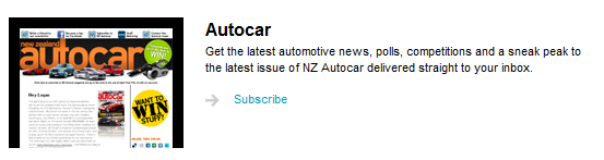
Fairfax media is a publication subscription company with a number of different physical and digital publications. Their digital publications are particularly good as they describe exactly what you will receive with each edition and give an example of what it will look like.
Their sign up process is easy, just requiring a name and email address and by giving their visitors a taste of what they can expect – this really does
2. First Digital
An online marketing agency – this company provides significant value when signing up to their newsletter by offering subscribers a chance to download a number of reports. The reports include useful documents such as social media case studies and search engine marketing support.
There is also an option where you can receive these reports without signing up to the newsletter.
3. The Warehouse
As soon as you log onto their website you are given the choice to sign up to their newsletter in a pop-up window. This gives users instant access to free information, the latest offers on the site and products available.
The only information that is required is your email address – giving visitors a quick and easy way to sign-up.
4. Grab a Seat
This organisation promises its users the very cheapest in airline seats. Their newsletter continues on with this promise by providing a guarantee that by signing up to the newsletter you will receive the latest offers and even faster booking times.
Their form requires a lot of information in order to sign up – however there is an option to use a Facebook account to auto-fill the information.
5. All Blacks Shop
Even the great national sporting team has a fantastic newsletter sign up at their website. Visitors are promised exclusive benefits and access to competitions, where they can win free products should they subscribe. The information to sign up is also pretty simple with just the email required.
The newsletter sign up is also very obvious on the front of the page – giving the sporting team more chance of converting readers into subscribers.
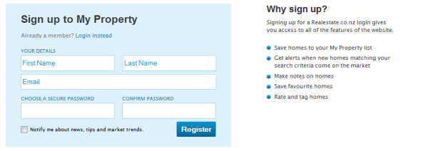
6. Real Estate
Real estate offers a host of benefits to those who sign up to their newsletter – including the ability to:
- Save homes to a property list.
- Receive alerts when a home matching their criteria is added to the site.
- Make notes on the homes on the database.
- Save your favourite homes on the site.
- Rate and tag homes on the database.
This is in addition to receiving the best tips, the latest news and trends in the market. Their sign up is quite simple with users only have to enter in a name, email and password. They also give users the chance not to receive the newsletter and just to sign up to the site.
7. Barfoot and Thompson
One of the biggest real estate companies in New Zealand is another in the industry with a great sign up list. This company doesn’t offer the same benefits as ‘Real Estate’ but it does have an easier sign up with only an email and a password required.
This site promises to send you the latest new properties and alerts about open houses in the area.
Take Action:
- Have a look through the websites above and see what style would suit your business best.
- Implement a really good opt-in page for your newsletters.
Conclusion
There are a number of organisations that offer various different ways to sign up for their newsletters. Each one is tailored for their audience – giving valuable content in exchange for the visitor’s details. What you need to do is apply the same thought pattern to boost the conversion of visitors to subscribers.
What offers do you have on your subscription page?
Let us know in the comments below:
Read post 1 Comment. Tagged in: email marketing, Opt-ins, sign up forms, Signups, Small Business